Does increasing the minimum wage increase GDP?
Bloggingstocks' Joseph Lazaro outlined the theory that it might back on 1 August 2009, shortly after the U.S. federal minimum wage reached its current level of $7.25 per hour (emphasis ours):
... the U.S. Federal Reserve will be monitoring prices and costs to see if the higher minimum wage is creating inflation havoc at a time when U.S. businesses least need another concern to deal with. Businesses have enough to worry about; and some are struggling just to maintain operations for another quarter or two -- the recession has been that damaging.
But the Fed will also be looking for signs of another side-effect, and this one is a positive one: a GDP boost. That's because millions of workers are going to get a raise that they otherwise would not have gotten, and that will increase their purchasing power.
The significance? Some of those increased-pay workers will choose to spend -- perhaps buying a washer or drier, making a down payment on a used car, or paying down a debt. It's quite possible -- although in these "frugal consumer" economic times no one is certain- - that the wage hike will increase U.S. GDP, serving as a small engine of growth as the U.S. economy inches back toward health.
It's an intriguing possibility isn't it? But has it worked out that way?
One way we can find out if boosting the federal minimum wage has boosted GDP is by examining the economic fortunes of the people most likely to be earning minimum wages in the United States: teenagers and young adults!
Together, individuals between the ages of 15 and 24 have consistently made up approximately one half of all minimum wage earners, so we should be able to use the personal income data the U.S. Census has collected and published for this age group for each year since 1994.

First, let's consider the population of 15-24 year olds in the United States, and the number of those individuals counted as having income from 1994 through 2010.
Over this time, the federal minimum wage has increased from $4.25 per hour in 1994, to $4.75 in 1996 and then 50 $5.15 per hour in 1997, where it held level until 2007. Beginning in 2007, it was increased by 70 cents per hour once a year up until it reached its current level of $7.25 per hour in 2009.
What we see however is that the number of teens and young adults with incomes has fallen over time. Our next chart shows the percentage of Americans between the ages of 15 and 24 who were counted as having income in the U.S. Census' Current Population Survey for each year from 1994 through 2010.

In this chart, we find that the percentage of teens and young adults who had incomes peaked in 1995, with 75.3% of the entire Age 15-24 population counted as having earned income in that year, which has since fallen to 59.9% as of 2010.
So far, both these charts indicate that the number of teens and young adults in the U.S. workforce has fallen from 1995 through 2010 - these charts don't tell us anything about how teens and young adults might have benefited from higher pay obtained through a rising minimum wage over time!
For that, we'll dig deeper in the U.S. Census' data and extract the data for the aggregate amount of income earned by individuals Age 15-24. Since one way of measuring the U.S. Gross Domestic Product is to add up all the income earned by people in the United States, we can use the Census' estimate of the aggregate income earned by U.S. teens and young adults to represent their contribution to the U.S.' GDP.
The easiest way to do that is to compare the amount of income earned by all U.S. teens and young adults in 1995, when the percent share of teens in the U.S. workforce peaked with the total amount of income earned by all U.S. teens and young adults in 2010, the most recent year for which we have data.

Coincidentally, selecting these particular years for comparision works especially well for our purposes, since it spans the increases in the U.S. minimum wage from $4.25 per hour to $7.25 per hour, with 1995 being one year before the first minimum wage increase in our period of interest occurred, and 2010 being one year after the most recent increase in the U.S. minimum wage took place.
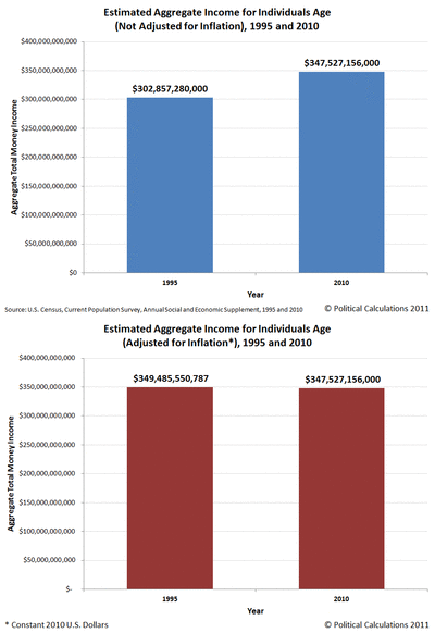
We'll also adjust the numbers to account for the effect of inflation, using an animated chart to show the results.
What we find in examining this chart is that for the 15 year span from 1995 to 2010, the nominal aggregate income of U.S. teens and young adults increased by 14.75%, from roughly $302.9 billion to $347.5 billion.
But most remarkably, in terms of constant 2010 U.S. dollars, the aggregate income of U.S. teens and young adults fell by 0.56% from $349.5 billion in 1995 to $347.5 billion in 2010. For all practical purposes, despite a 70.6% increase in the nominal value of the U.S. federal minimum wage from $4.25 to $7.25 (a 21.8% increase in real terms), the total amount of income collectively earned by the predominant earners of the U.S. minimum wage in the United States is unchanged.

Let's take a step backwards and consider the nominal income distribution of teens and young adults in both 1995 and 2010 in nominal terms.
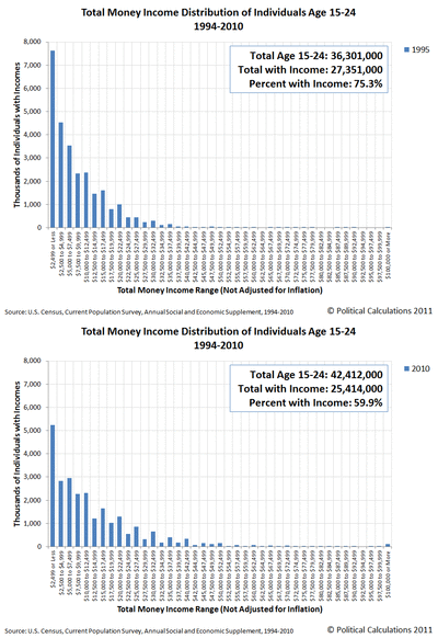
Our next animated chart shows how many thousands of Age 15-24 individuals the U.S. Census counted within each $2,500 increment of total money income in both 1995 and 2010.
Here, we find that the distribution of income has shifted primarily at the lower end of the income spectrum. Our final chart quantifies the changes for each of the U.S. Census' measured income increments.
Here, we note that an individual earning the U.S. federal minimum wage of $7.25 per hour in 2010 who works full time (2,080 hours per year = 8 hours a day, 5 days per week, 52 weeks per year), would earn $15,080 in a year. That puts all the income affected by increases in the U.S. federal minimum wage over time below this level.

What we find is that this income range at the lowest end of the income spectrum for Americans between the ages of 15 and 24 is the only income range where there have been reductions in the number of individuals with incomes between 1995 and 2010.
We also find that the number of individuals with incomes below $15,000 has fallen by 5,045,000 from 1995 to 2010. Meanwhile, we find that the number of Age 15-24 individuals with incomes over $15,000, which would be considered to be largely unaffected by increases in the U.S. federal minimum wage over time, has increased by 3,105,000.
Overall, there are 1,940,000 fewer individuals between the ages of 15 and 24 with incomes in 2010 than in 1995.
Consequently, we find that increasing the federal minimum wage has failed to increase GDP over time. Worse, we find that increasing the federal minimum wage has actually increased income inequality within the Age 15-24 population from 1995 through 2010, as the same aggregate income, when adjusted for inflation, is effectively being spread among nearly two million fewer people.
Returning to Joseph Lazzaro's thoughts on the topic:
... if the Fed and other organizations can verify that the minimum wage increase has boosted GDP without a loss of jobs, or inflation, Congress may to consider another decision in the quarters ahead: a decision to raise the federal minimum wage again, this time to $8.25 per hour.
In our view, the only reason the U.S. Congress would choose to increase the federal minimum wage again would be to ensure the onset of a new recession.
This concludes our annual anniversary post, where we celebrate the biggest ideas we've developed during the past year! This year's anniversary post was a bit unique in that it combines two of the areas in which we've made a mark (or left one!): the real impact of minimum wages on the U.S. teen population and the real nature of income inequality in the United States.
As for the biggest ideas we've developed in previous years, here's the list:
- 2005: A Year's Worth of Tools - we celebrated our first anniversary by listing all the tools we created in our first year. There were just 48 back then. Today, there are over 259....
- 2006: The S&P 500 At Your Fingertips - the most popular tool we've ever created, allowing users to calculate the rate of return for investments in the S&P 500, both with and without the effects of inflation, and with and without the reinvestment of dividends, between any two months since January 1871.
- 2007: The Sun, In the Center - we identify the primary driver of stock prices and describe a whole new way to visualize where they're going (especially in periods of order!)
- 2008: Acceleration, Amplification and Shifting Time - we apply elements of chaos theory to describe and predict how stock prices will change, even in periods of disorder.
- 2009: The Trigger Point for Taxes - we work out both when, and by how much, U.S. politicians are likely to change the top U.S. income tax rate.
- 2010: The Zero Deficit Line - a whole new way to find out how much federal government spending Americans can really afford!
Thank you for joining us for our anniversary! We appreciate that there are a lot of ways you can choose to spend your time, and we greatly appreciate your willingness to share so much of it with us over the past year.